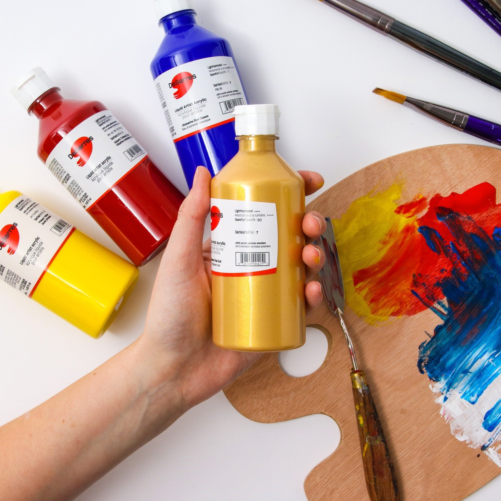
The labels on tubes and jars of paint feature all sorts of useful information. But it often appears in short form to fit in the small space on the container. So what does it allreally mean? Here’s a list of the most common details you may find. Each element will not necessarily appear on every product label, and the information provided may varydepending on the manufacturer.
Colour: The name of the colour of the paint in the container.
Hue: If a hue designation is provided, this indicates that the paint is composed of an imitation pigment.
Iridescence or interference: If a given paint is iridescent or metallic, this feature will appear on the label. Iridescent colours, made with mica particles, are pearly and look somewhat metallic; true metallic colours can be created by mixing an acrylic medium with powdered pigments.
Opacity and transparency: The words opaque, translucent and transparent indicate the transparency of the pigment (i.e., how its molecules absorb and reflect light.)
Pigment: Most paint labels will show the common names of the pigments used along with their colour code. The pigment identification chart is an international naming system that can help you select your colours. While companies are free to name their paint colours whatever they wish, they usually use this system to indicate the pigments that each of their paints are made of. Referring to these codes makes it much easier to choose consistent colours regardless of the brand of paint you are purchasing.
The first two letters identify the colour:
- PB = Blue pigment
- PG = Green pigment
- PR = Red pigment
- PV = Violet pigment
- PY = Yellow pigment
- PO = Orange pigment
- PW = White pigment
- PBR = Brown pigment
- PBK = Black pigment
The pigment letters followed by a number indicates the paint’s chemical compounds. For example, ultramarine blue is PB29, and quinacridone magenta is PR122. Two different colours may be derived from the same pigment if two different forms of the same chemical formula are used. For instance, PV19 in g form is quinacridone red while PV19 in ß form is quinachridone violet.
Lightfastness or Permanence: The lightfastness indicator gives the colour’s resistance to light exposure (i.e., how likely it is to fade or change over time.)
- Degree I: High resistance to light
- Degree II: Medium resistance to light
- Degree III: The colour fades easily, and is not to be used outdoors.
Some manufacturers use the permanence system instead:
- AA: Extremely permanent
- A: Permanent
- B: Moderately permanent
- C: Fades easily
Munsell hue: The Munsell hue system is a numerical system that shows the paint colour’s position in relation to other fixed positions on the colour wheel.
Relative hue: This diagram illustrates a classification system similar to the Munsell
hue system. For instance, it’s a quick way to see that ultramarine blue has violet undertones, not green ones.
Value: The value or tone indicates a colour’s lightness or darkness, from pure white (10) to pure black (0). In other words, the higher the value, the paler the colour.
Chroma: This number indicates the colour’s intensity on a scale of 0 to 20. In other words, the more vivid the colour, the higher the number.
Pigment toxicity: You should see either a seal of non-toxicity (AP or CP) or a square symbol indicating the presence of potentially hazardous pigments. If you see a square (e.g.: Cadmium or cobalt,) you may want to check the specific toxicity information provided (irritant, carcinogen, etc.), which should appear with a notice of the precautions to take when using the product.
Binder: This indicates what sort of binder is used in the paint (i.e., acrylic polymer emulsion.)
Product number: Each company has its own numerical system for its product codes, and these numbers may be found in different areas of their product labels. The product
number can be useful if you want to make sure you’re getting exactly what you want when you purchase additional quantities.


